Navigation Tool for Indian Cities
Google UX Design Professional Certificate | User Experience design | Visual Design
The pulse of Indian city life is defined by its streets and how people move through them. This project explores the potential to redesign and elevate urban navigation tools specifically tailored for the Indian context. Starting with extensive foundational research on the anatomy and function of maps, the project synthesizes these insights to frame a clear problem statement. By mapping user personas and their primary pain points, the research seamlessly translates into targeted ideation, culminating in the final prototype.
Background
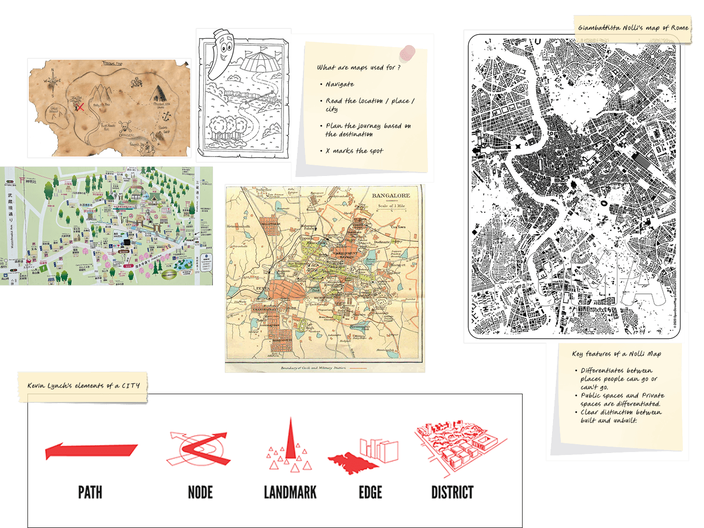
A foundational background study was conducted to explore the core utility of maps and how users naturally interact with them. By reviewing historical precedents in cartography, the goal was to extract the essential design elements that make a map both intuitive and highly readable. By synthesizing these insights, the primary objective was to identify the characteristics that define a highly legible, user-centric, and effective map.
Preliminary user research
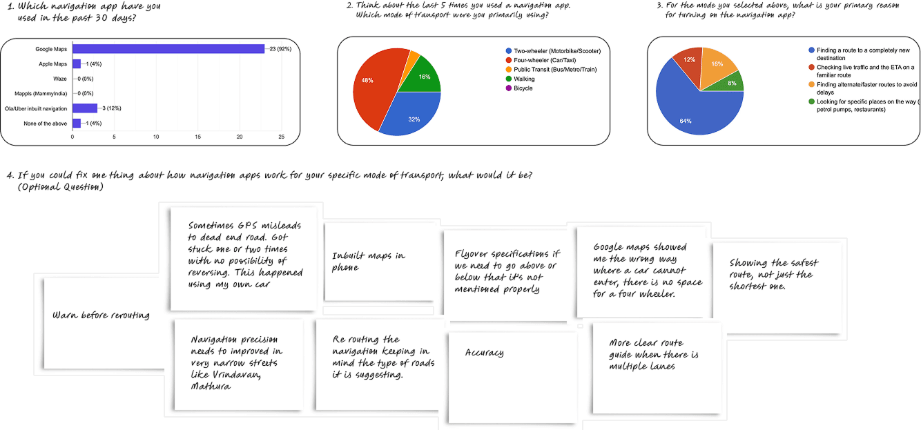
An online survey was conducted to understand how people in India use navigation apps and which ones they prefer. The research focused on their most common modes of transport, the journeys they make, and the challenges they face while navigating Indian cities.
Key insights
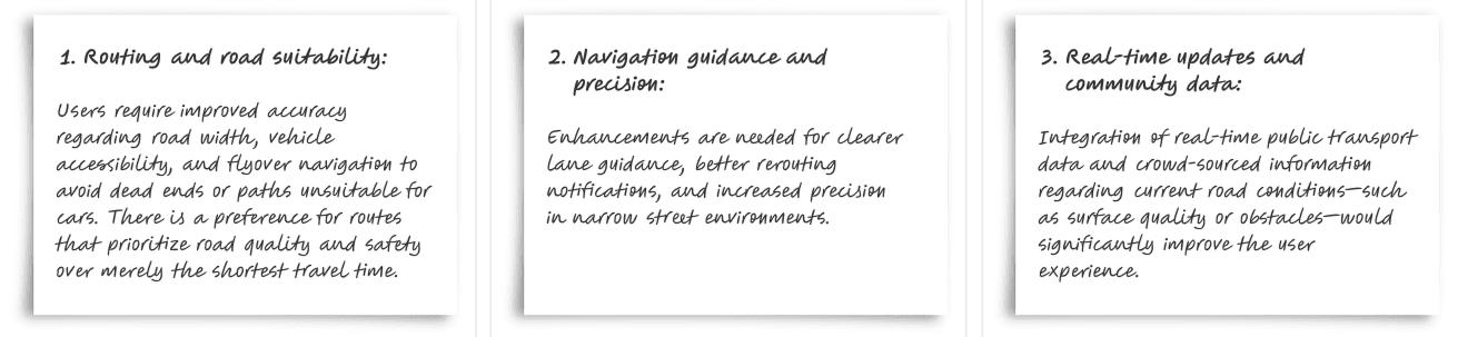
Competitive analysis — Google Maps and Nolli app
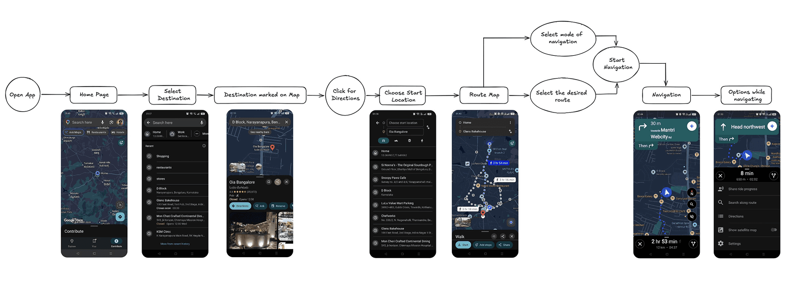
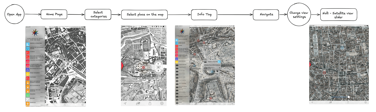
Google Maps is one of the most robust navigation applications available today. This audit examines how its global features translate to India’s localized navigation habits, dense urban layouts, and diverse mobility needs.
Step 1: Analyzing user flow
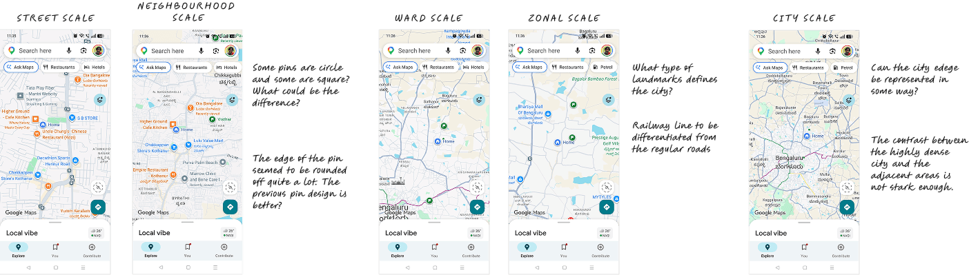
Step 2: Analyzing visual design of the actual map
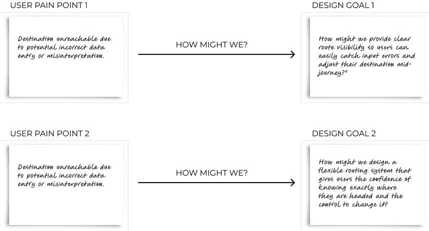
Design goals
Visual design exploration
Drawing from an architectural background, the design focuses on spatial hierarchy and wayfinding—making the map interface both more readable and intuitively perceivable while preserving the familiar navigation experience.
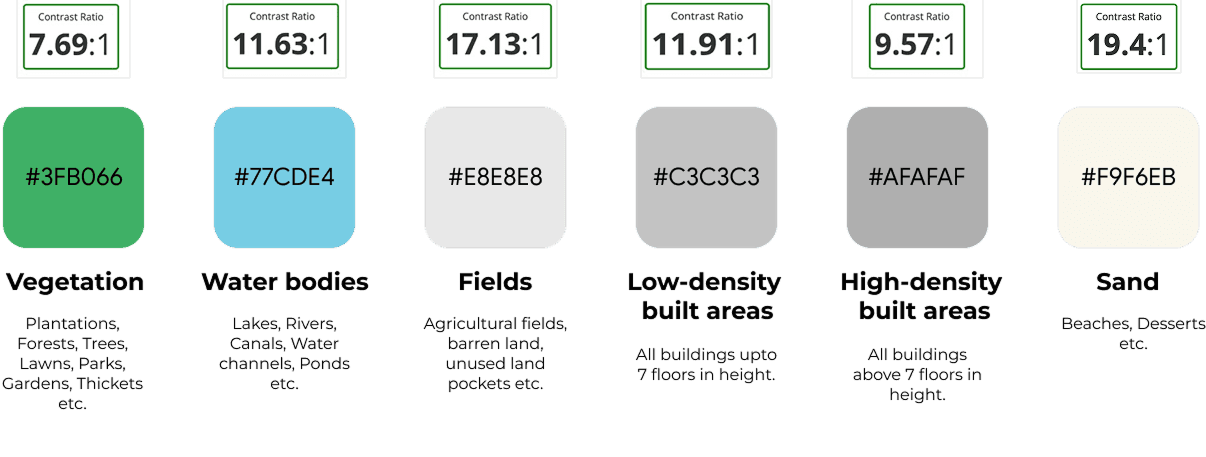
1. Colour scheme — district scale
2. Map pins and icons
Indian streets are densely packed and incredibly vibrant. Therefore, designing of these pins became extremely crucial, so that it allows the clustering and overlapping of various information. Each marker can be anchored to its exact street—so users are never left guessing in a maze of crowded intersections and parallel lanes. The colour scheme is also done based on Urban studies grouping of different landuse components of Indian cities.

3. Map at different scales
City scale
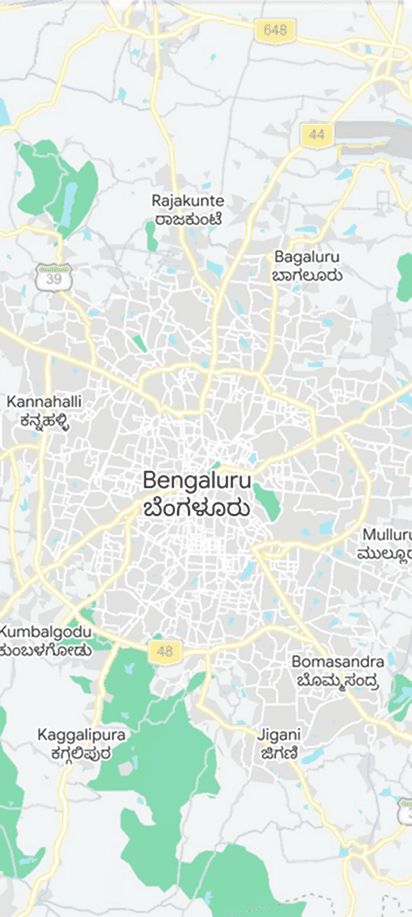
CitiesTownsProvincesVillages
Zonal scale
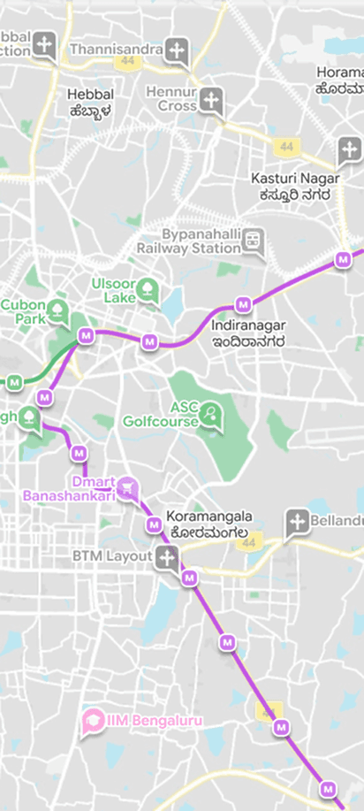
City landmarksImportant junctionsRailway stationsMajor bus stopsCity areasRecreational areas
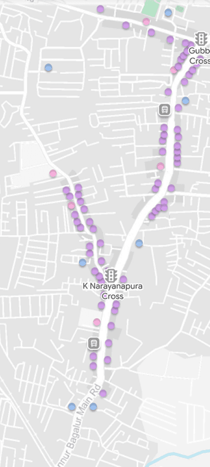
Neighbourhood scale
JunctionsTraffic signalsImportant roadsLakesLanduse
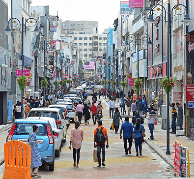
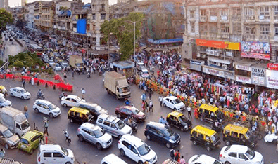
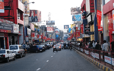
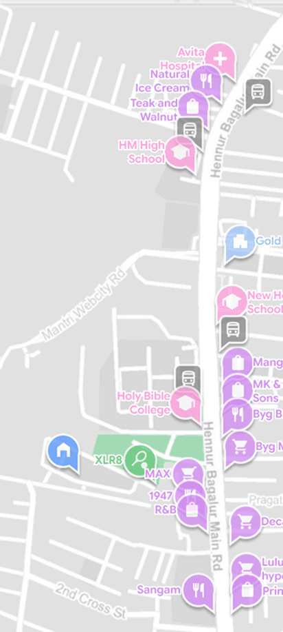
Street scale
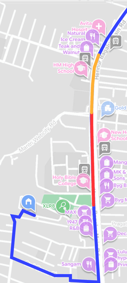
Work in progress
Appendix
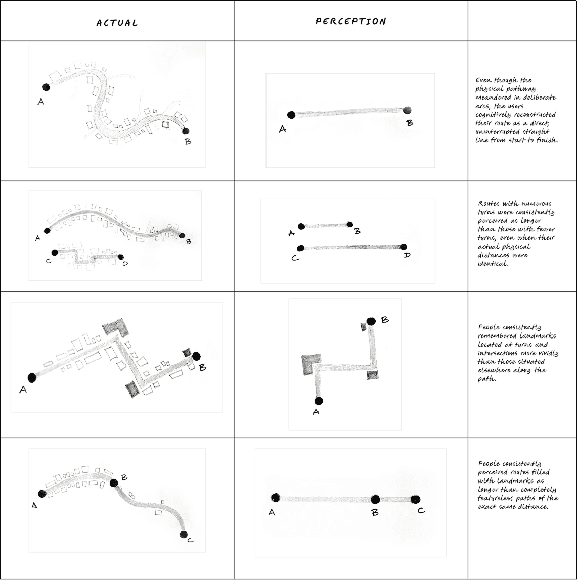
User perception research — mapping activity
To understand people’s perception of maps, a mapping activity asked participants to select a familiar daily journey and draw a map from memory without phones. The exercise reveals which landmarks, turns, intersections, and distance cues are most meaningful for navigation.